Have you noticed the ads you get on gaming apps that you simply can’t exit out of? The ads for which the “close” button is so small that somehow you end up touching the area outside and get redirected to somewhere else? You may be wondering, why would any self-respecting designer make a design so annoying to the users. The fact is, these are not bad designs, they’re designed to make users do a particular action, like downloading or signing up for something. These designs are called “dark patterns” in UI/UX.
So, what exactly are them?
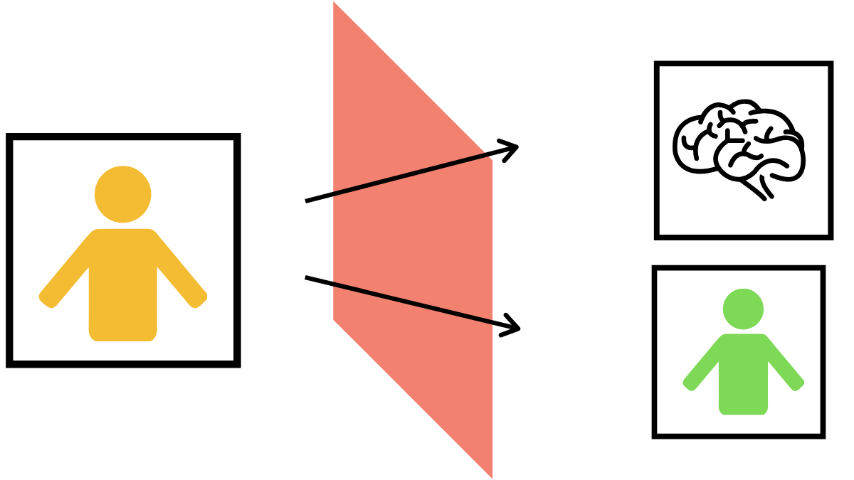
Good UIs come out of a careful understanding of the users. The idea is to let the users accomplish what they want to accomplish. The user makes the choices. With dark patterns, the user-psychology is used to make users do what the designer wants them to do. It could be forcing a visitor to sign up for a newsletter, or it could be making it difficult to get out premium subscriptions.
Dark patterns existed even on print media, way before websites or mobile apps existed. Have you ever read the terms and conditions before making a purchase? Think about the last time you signed up for insurance or mutual funds. Were you able to easily make sense of the legalese? Most of the time, they are written at the very bottom of the paper or somewhere you won’t notice, in very small fonts.
The “fine-print” from print media is somewhat analogous to dark patterns on electronic media.
Dark patterns really remind you of those scenes in sitcoms where they tried to cancel their gym membership or their television plans.
Examples of dark patterns
The most common cases of dark pattern are seen on ads. As mentioned above, they can be ads that are impossible to close. Sometimes the close icons are impossibly small, sometimes it’s very difficult to see.
Another commonly seen dark pattern is on websites themselves. Same as before, they’re popups that appear almost impossible to close. Or sometimes it may look like you need to sign up for something for you to access the contents of the website. On websites that ask you to sign up for a subscription, it may seem almost impossible to unsubscribe.
With GDPR making it mandatory to ask for consent before using cookies, that has created a set of dark patterns. Except in the case of very few websites, all the consent forms have either “Accept all” or “Settings” only. An option to “Decline all” is rarely seen. If you actually go into the settings there are options to decline all the cookies. But most users simply want to remove that popup and are likely to click “ Accept all”.
While these may seem like minor conveniences or annoyances, dark patterns are also used for ethically greyer activities. Dark patterns have become a common trend in apps for gig workers. Many workers have noticed how companies often trick them into believing they’ll get higher incentives than what they’d actually get. Ride-sharing companies have recently come under fire for many reasons. Some of them have been accused of using psychological tricks to manipulate drivers into taking more trips. For example, having their next fare ready on the driver app before their current trip is over.
Types of dark patterns.
A common type of dark pattern almost everyone has encountered is the bait and switch type. It’s a trick often associated with popups on shady websites. Instead of closing the popup, the button leads you to another page. But you may also have noticed that, in earlier versions of Windows, if you try to close the update windows notification, the system starts the update. In this type of dark pattern, a UI element appears to do something but actually does something else.
There’s also the old and familiar hidden charges. It’s very similar to how you order food from a restaurant checking the prices making sure you’re not going above the budget. And when the bill comes, they’ve added taxes, service charge, etc, and you’ve overshot your budget. Pretty sure everyone must have come across this on food delivery apps. By the time you checked out prices would be way above what you expected.
A familiar but subtle type of dark pattern is confirm-shaming. How many times have you come across opt-out buttons that said something like “No thanks, I don’t want to fix my life” or “I don’t want a box of free goodies or assets”? While subtle( not so subtle in some cases), they’re using psychological tricks to make the user choose something they don’t want. You can find a lot of examples of this on this tumblr.
Harry Brignul, a UX researcher who coined the term “dark patterns” has created a whole list of dark patterns in his website. You can also view a Hall of Shame dedicated to websites and apps with dark patterns.
Why should you refrain from using dark patterns?
Let’s face it, there’s a reason why designers use dark patterns: it yields results. Dark patterns lead to more conversions, at least in the short term.
If so, why should you not use such tricks?
For starters, tricking people to do something they don’t want to is not ethical.
In some cases, using dark patterns is illegal. For example, the bait and switch tactic is illegal according to US Fraud Law. According to GDPR, consent for using personal data should be obtained in unambiguous, freely-given, and specific to each usage of personal information (Source: Wikipedia).
But more than any of these reasons, the main reason you should refrain is that it damages the user’s trust. Fool your user once, shame on you…. And everyone knows its not easy to gain a user’s trust, and it can affect your brand’s reputation. News spreads fast, and the small gain you achieved with dark patterns will be short-lived. As a UI/UX designer, the main skill you should have is empathy. View every one of your designs from the perspective of a user, because they’re the ones who’ll actually use them.


